I had used the Fox theme in Sublime Text for the past few years, and recently came across Material Theme. After I tried it out I couldn't stop making other tools in my workflow match the theme. Here's what that looked like:
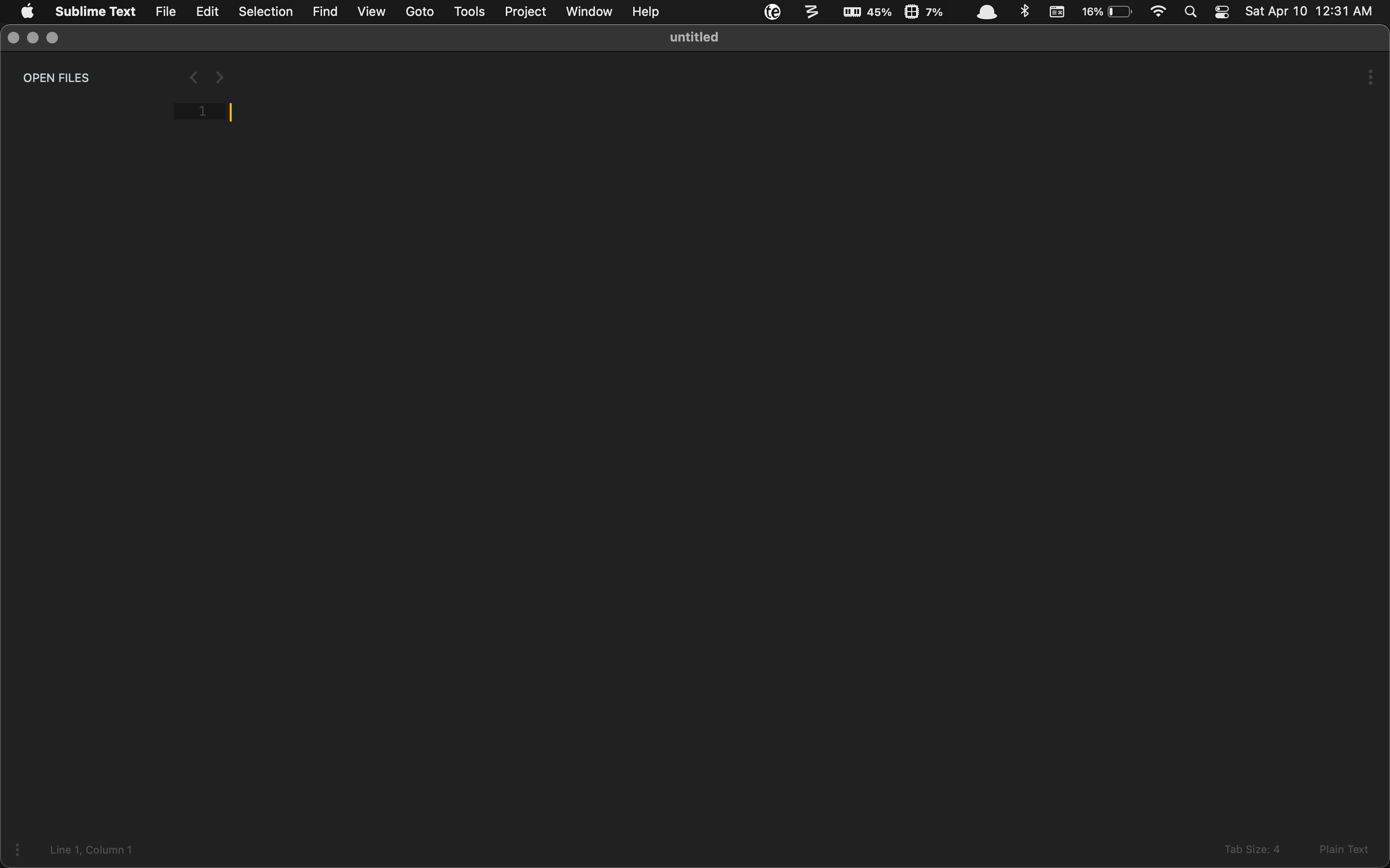
A blank canvas
This is Material Theme without any open files:
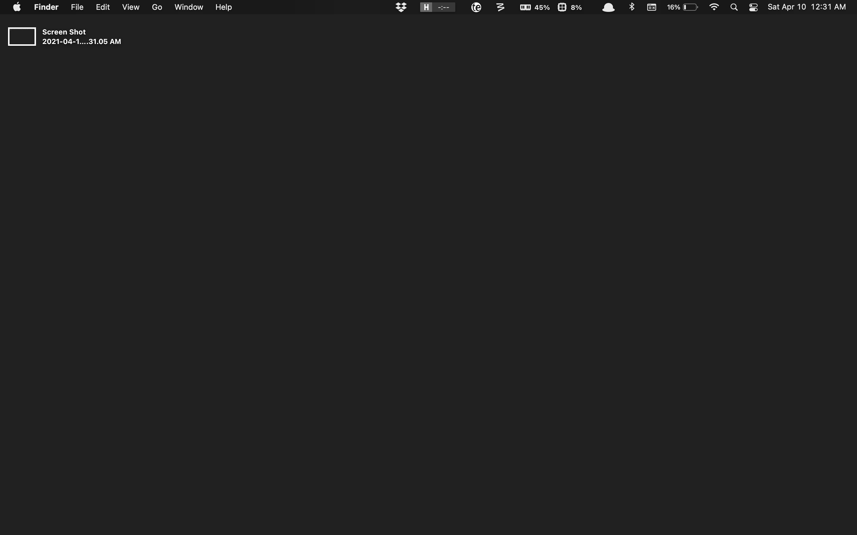
My desktop
I was already using a dark gray background, so I changed the color to match the theme exactly.
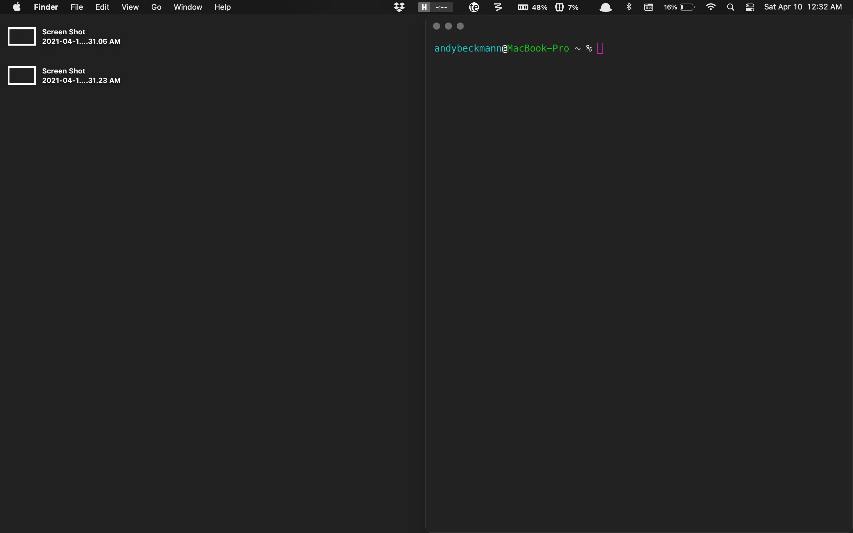
My terminal
Same thing with my terminal. After the first two, it was clear I needed to make my terminal fit in:
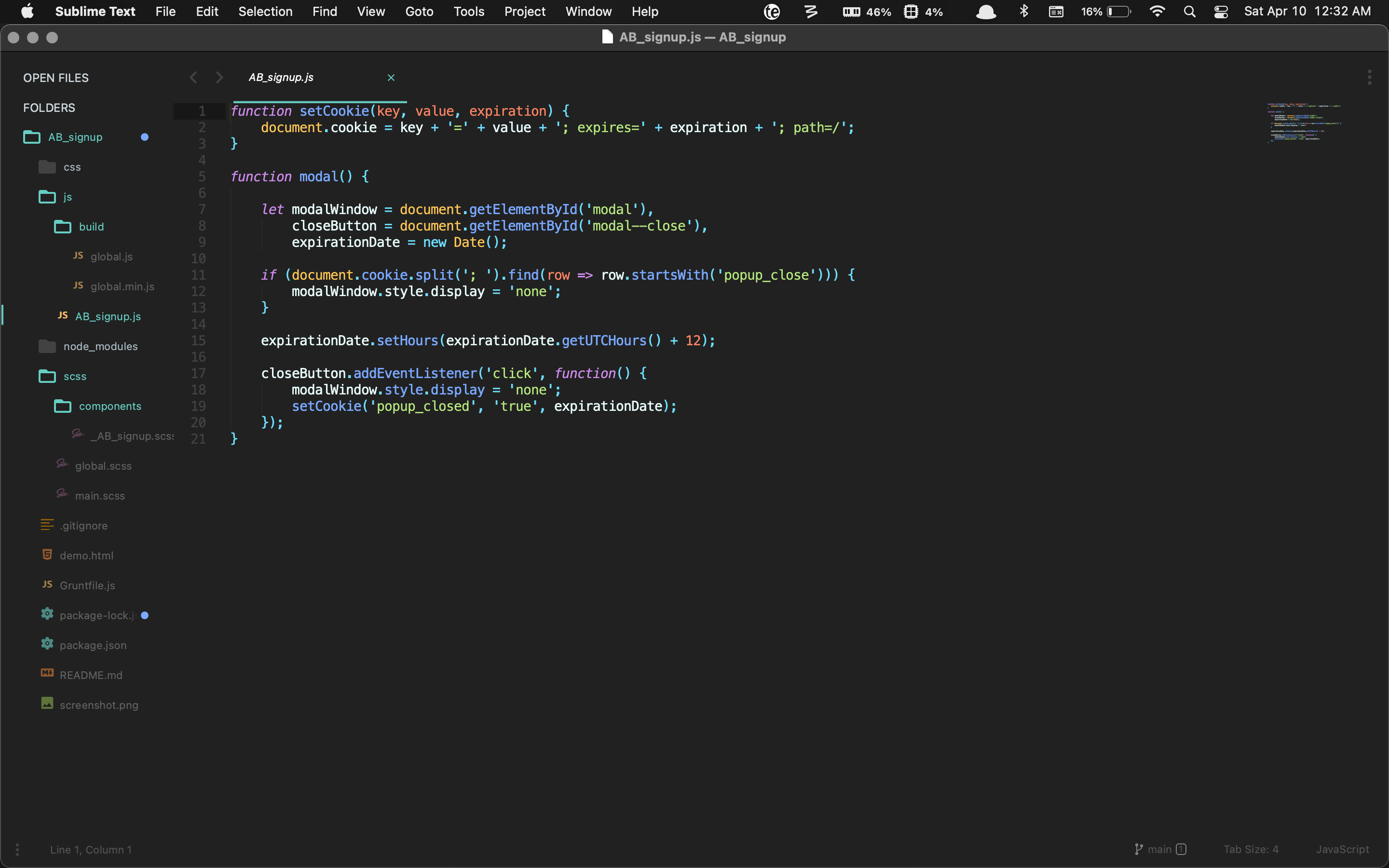
Sublime Text
Here is what Material Theme looks like with a project open.
First impressions
I really like the theme and how minimal it is. The comments seem a little too dark, but I realized that makes the code stand out more instead of getting lost in large blocks of comments. I think the trade off of less readable comments for cleaner and clearer looking code is worth it here.
Below are instructions for installing Minimal Theme in Sublime Text 3:
Installation
-
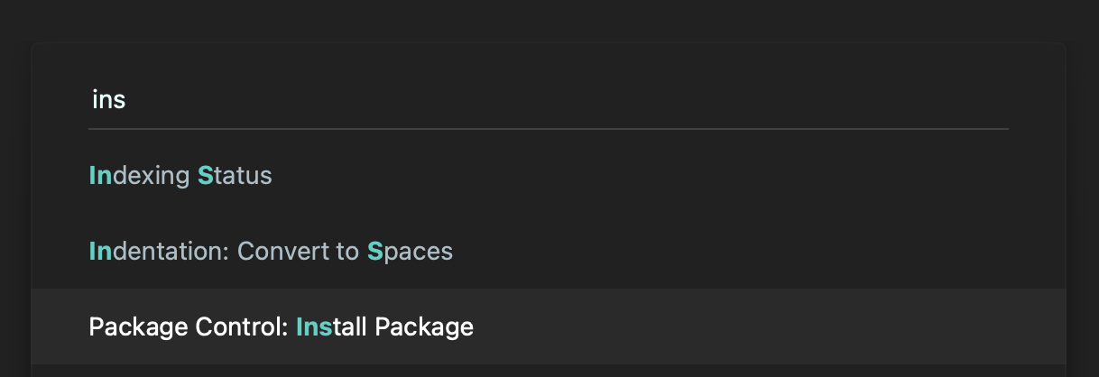
Install Material Theme by pressing CMD+Shift+P and selecting Install Package.
-
Search for the name Material Theme and hit enter.
-
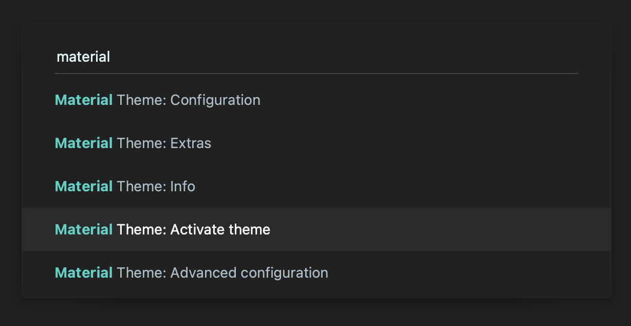
Once Material Theme has installed, press CMD+Shift+P again and type "Material Activate" and hit enter. This will activate the theme.
Repository
The code is also available on GitHub.com: https://github.com/equinusocio/material-theme